
Cander
Cander supercharges e-commerce businesses by replacing the traditional (and boring) gift message box with QR virtual greeting cards & gift messages.
Project Details
Role
Lead UX/UI Designer
Team
Contract role. Worked with Founder, graphic design team and 1 UI Designer.
Users
Gift senders
Tech
iOS app
Goal
Redesign the start up flow for new and returning users to improve sign up rate
Summary
Cander’s first time UX was not optimized for quick user value. When I first started on this project, users were first taken to their contact list to begin a message send flow, without having the opportunity to explore what the app had to offer. I designed a brand new user flow with the goal of improving user sign ups, and decreasing drop offs.
The Challenge
I was tasked with the challenge of creating a new user flow to go along with our new feature: Create a message from a template for audio, image or video.
User Experience Principles
I find value in creating a list of research-based UX, Design and Accessibility principles for a product or feature before I jump into any product work, whether it’s designing, researching or feature ideation. Using these principles as a guide helps align teams, focus features, and keep designs in check.
The UX Principles I selected for this project included:
Discoverability
-
Can the user determine what actions are possible and the current state of the product? Is there a way to explore the app without executing each stage of the product?
Informative Feedback
-
Is there feedback for common tasks such as video submission, save, delete?
Conceptual Modeling
-
Are flow, icons, and features similar to other commonly used video editing, and messaging sending software, such as Instagram, TikTok, Snapchat?
Consistency
-
Is there consistency in language and design elements?
Natural Dialogue
-
Do users know what comes next? Is there a beginning, middle, and end to a task? Is there excess design or copy on a screen?
Error Prevention & Recovery Support
-
Does the product let uses know if they have made an error? Is there a way to save progress? To undo unintended actions? Can users review their message before sending?
Accessibility
-
Are fonts large enough and legible? Is there enough color contrast between text and background? Are difficult to distinguish colors avoided?
Help & Documentation
-
Is there a way for users to get help along the way? Or outside sources to reference?
Aesthetic & Minimalist Design
-
Is there excess copy? Efficient use of white space? Does the design, color scheme, etc. fit with the product's intended purpose?
Flexibility
-
Is there a good navigation system? Can users easily switch between different features of the app? Different areas of video editing?
Personas

Millennial Marisa
Marisa is a social, creative and upbeat PR manager. She’s always trying to keep in touch with friends and family no matter where they live. Marisa loves to celebrate special events in her loved ones’ lives and is looking for a fun, sustainable and personal way to send gifts and messages.
Insights
UI must be fun and aesthetically pleasing
Must have customizable elements and filters
Need the ability to save photos, videos and designs

Busy Benji
Benji is a busy young professional who doesn’t have much time to spend finding the perfect gift, or writing a well-thought out message on a card. He prefers to just send cash, but needs a safe way to do so. He also doesn’t want his cash gifts to seem too impersonal.
Insights
Must be peer-reviewed and trusted
Fast-loading app with quick and easy to find options
Personalized messaging

Aunt Alice
Aunt Alice has been invited to use Cander by a loved one. She is retired and in her 60s. She loves her family and loves to celebrate and enjoy with them in their special life occasions. Alice needs to be able to use Cander, as requested by her niece, to send a message and cash for a special event, while not being familiar with many modern, new apps. She needs a system that is easy to use, clearly defined and not frustrating.
Insights
User flow must be easy to use and intuitive
Icons must be universally understood (or provide text context)
Must provide added value if we want her to use Cander again
Discovery Research
I knew that we needed to change what users saw when they opened the app, but I needed more information. From some preliminary brainstorming, the team decided to start offering pre-made designs for Cander users to choose from. I conducted user research with past users and potential future users to determine the next steps.
Findings:
-
Weddings were the most popular occasion for sending cards and cash, so these must be included in our template designs
-
Currently, users send messages, videos and phone call their recipients, so we must be able to support multiple preferred messaging types in our flow
-
Users’ favorite part of Cander is the ability to add “fun” additions such as text and stickers to a video. We must continue to support that in our pre-made designs, as well as in our non-video options
-
Users found the current UI and flow to be “simple,” “easy to use” where “no tutorial was necessary” so we need to remember not to steer too far from this in the new design
-
There were multiple complaints of not knowing if a message was sent. We must provide clear feedback to users.
Pen & Paper
Using the design principles and personas I created, coupled with the affinity maps resulting from user research, I started to create some pen & paper sketches to get all my ideas out in the open. This step of the process helps to hash out ideas, quickly share and determine how to move forward


Wireframing in Figma
After consulting with Cander’s founder and our UI Designers, a preferred user flow was chosen, and I narrowed down the features, while translating my sketches into wireframes in Figma. Using a shared, online workspace is imperative on a remote team, and allows for all team members to make comments and see what others are doing in real time.


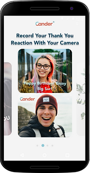
Final Design
The end result is an improved and streamlined user flow from the first time a user opens the app to allow a quick and easy path to value right after signing up.

Results
These key design changes led to an increase of 60% in sign ups.